KOPI KENANGAN
A leading coffee brand in Indonesia
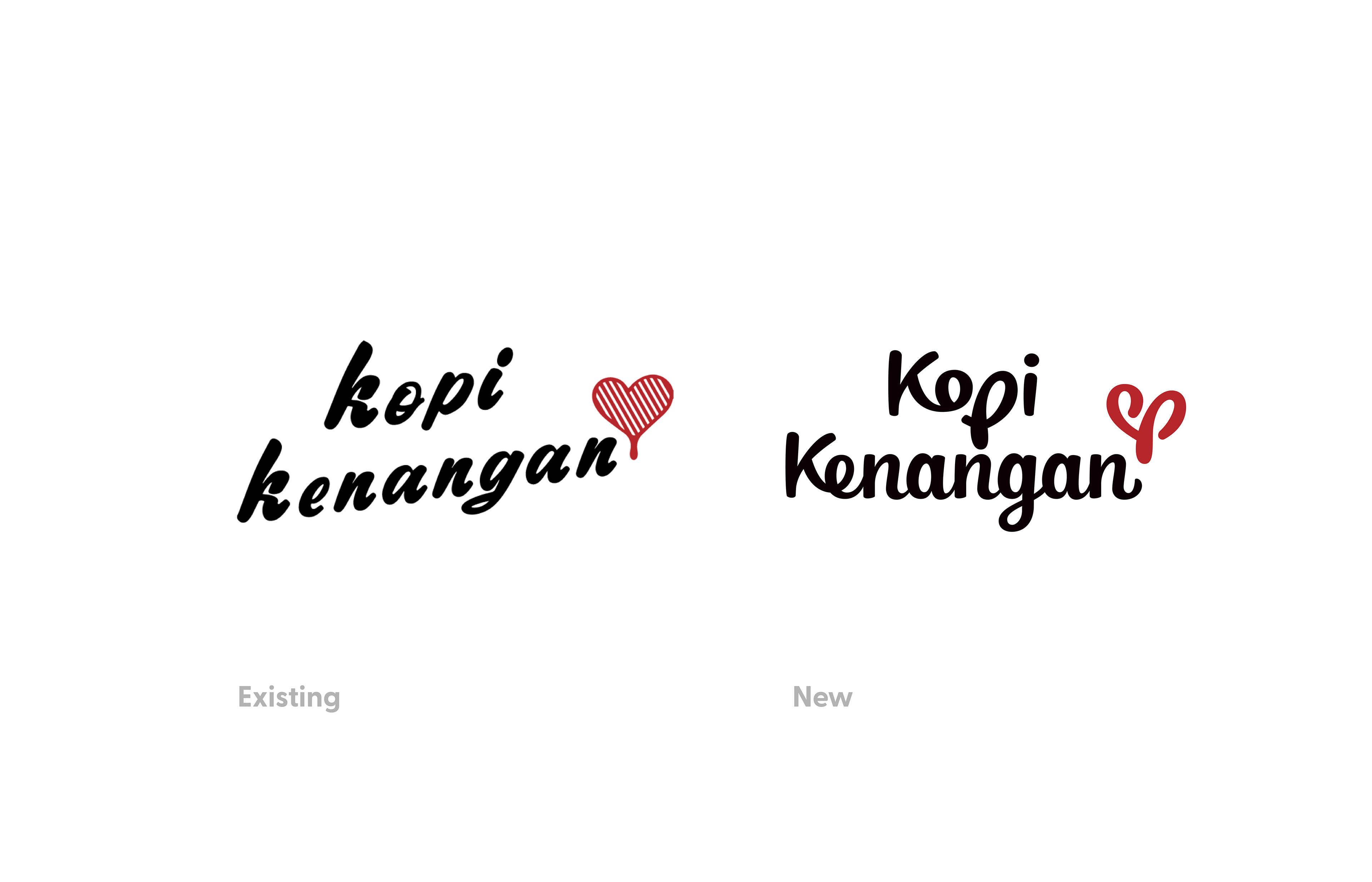
This is a fun personal project to help me practice and improve my design skills, especially in custom lettering, which I find quite challenging to master. I noticed their existing logo feels a bit off, script fonts generally shouldn't be spaced out, and the angle is too steep
and the all-lowercase style doesn’t quite work visually.

The Logo
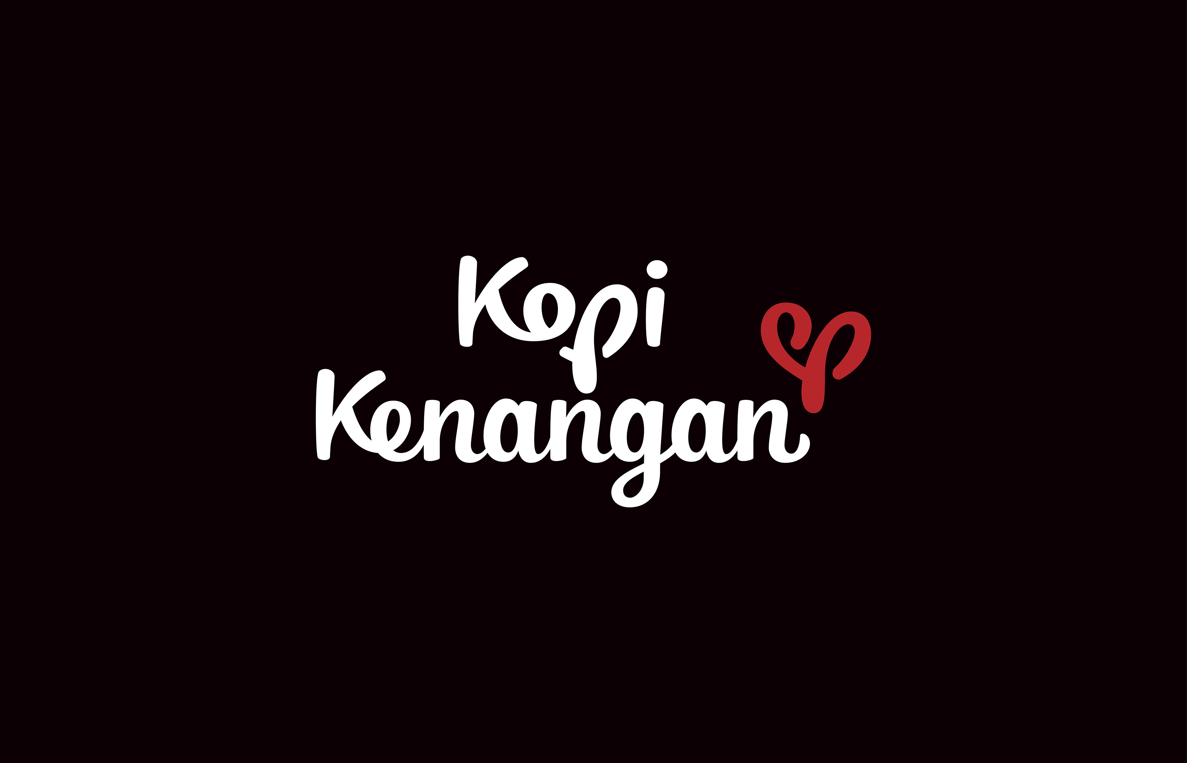
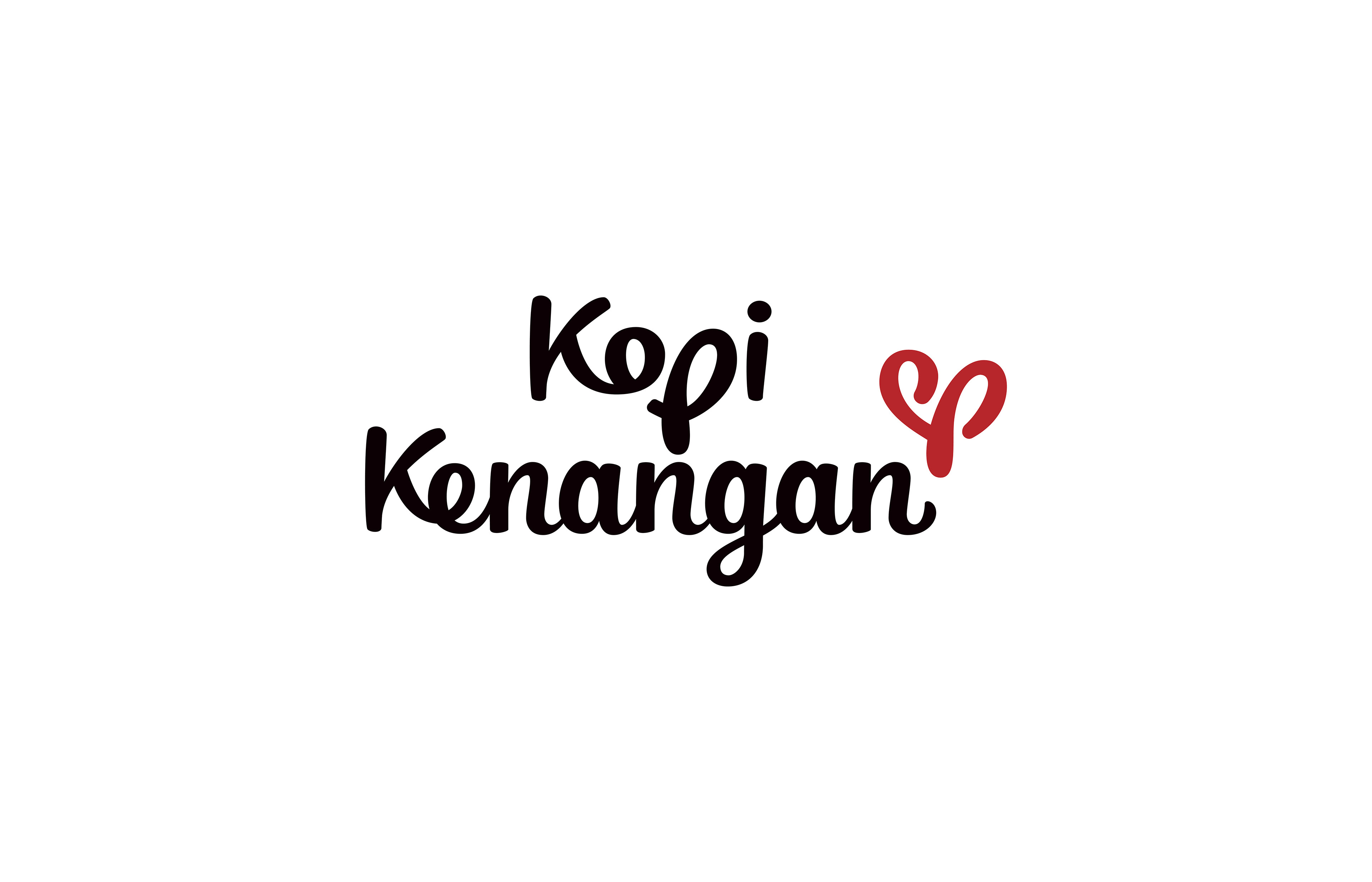
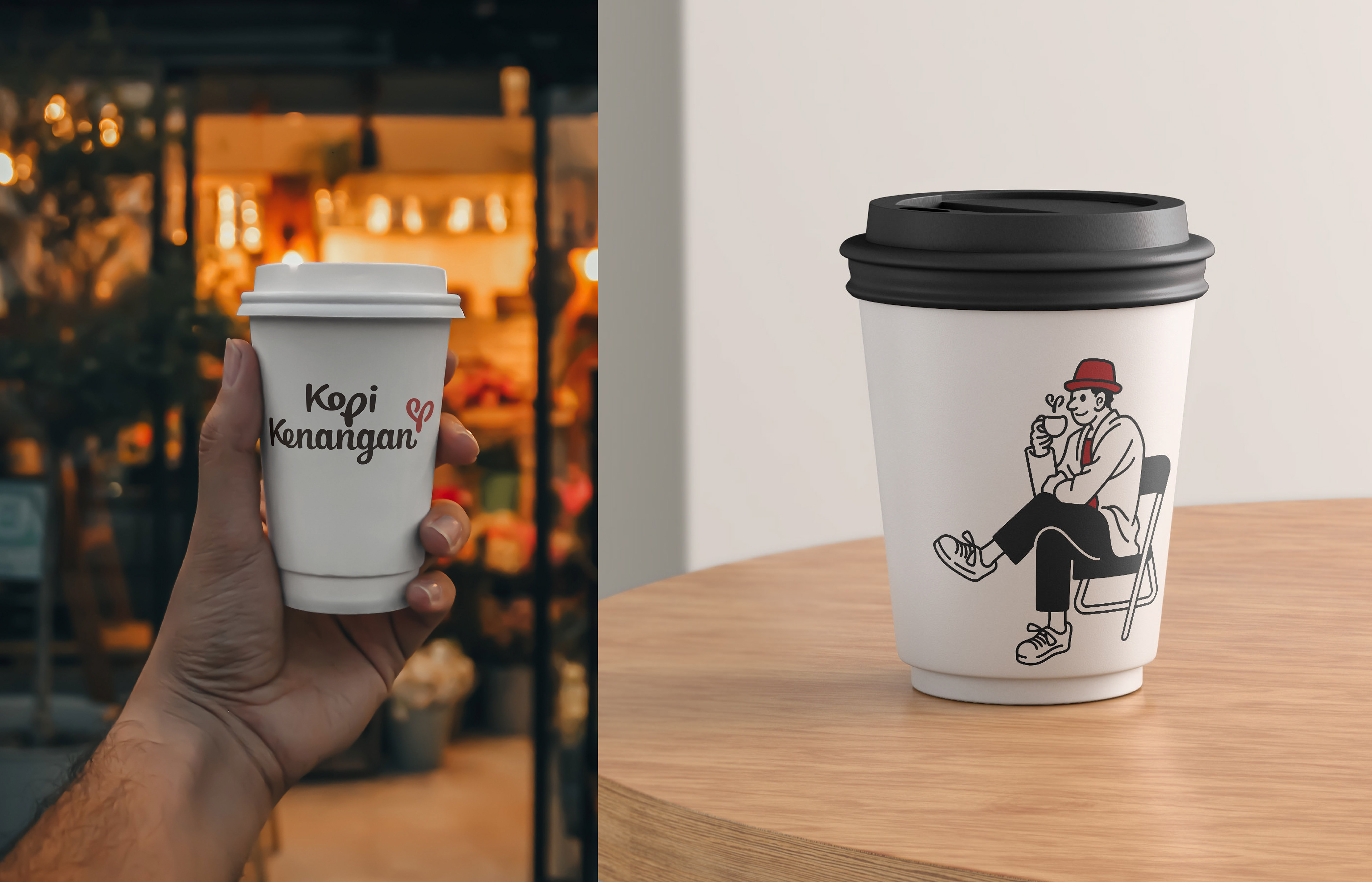
The logo concept retains the use of a script font, but this time it's a full custom font, featuring subtle heart-shaped elements within the letters 'o' and 'p'. The standalone icon is also heart-shaped, incorporating a droplet at its center.
The word Kenangan means 'memory' in Indonesian, but in slang, it often carries the weight of a bittersweet love that didn’t last.